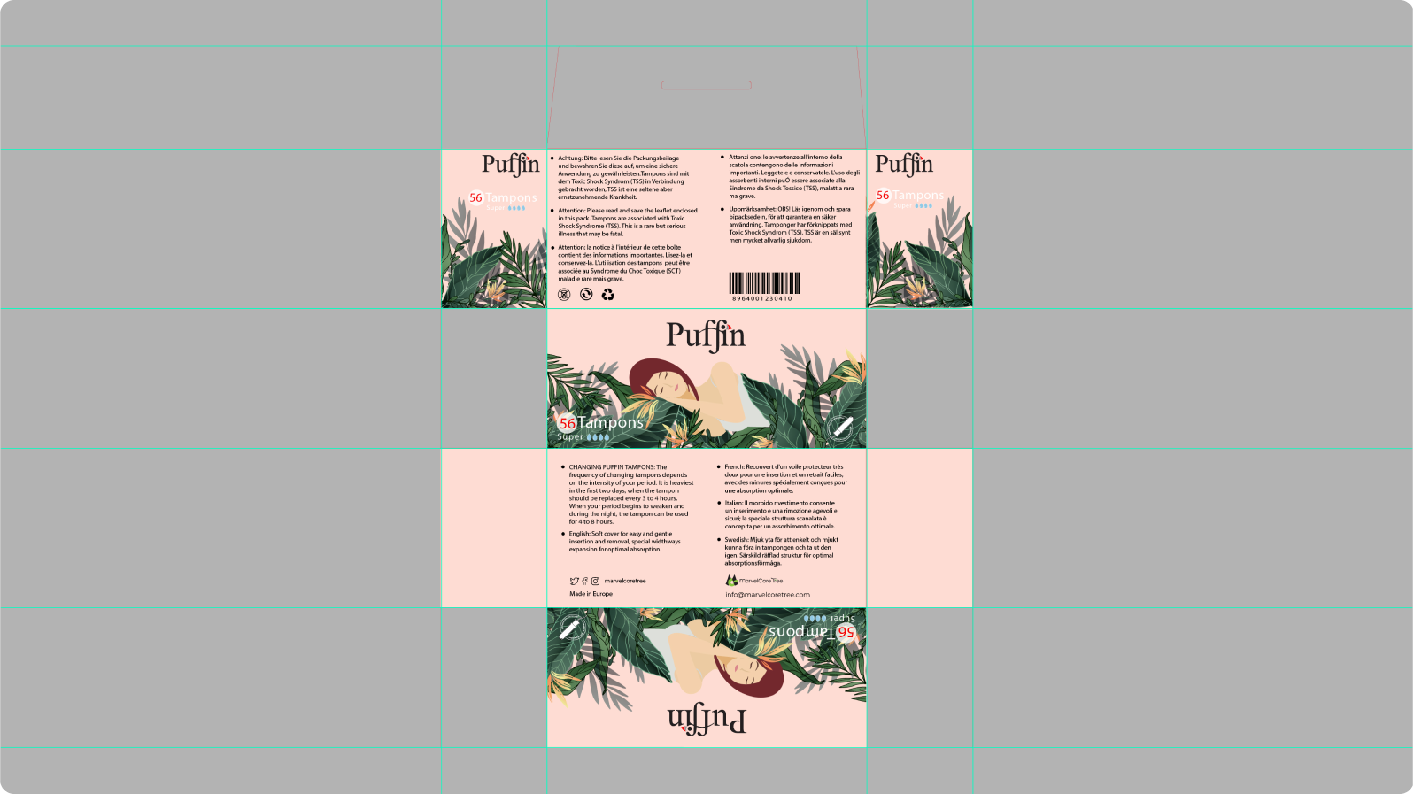
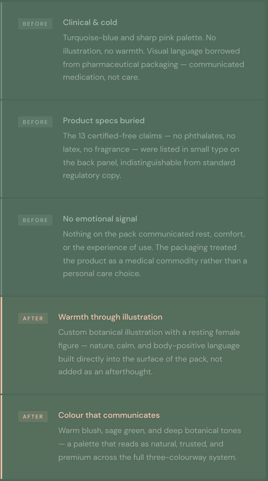
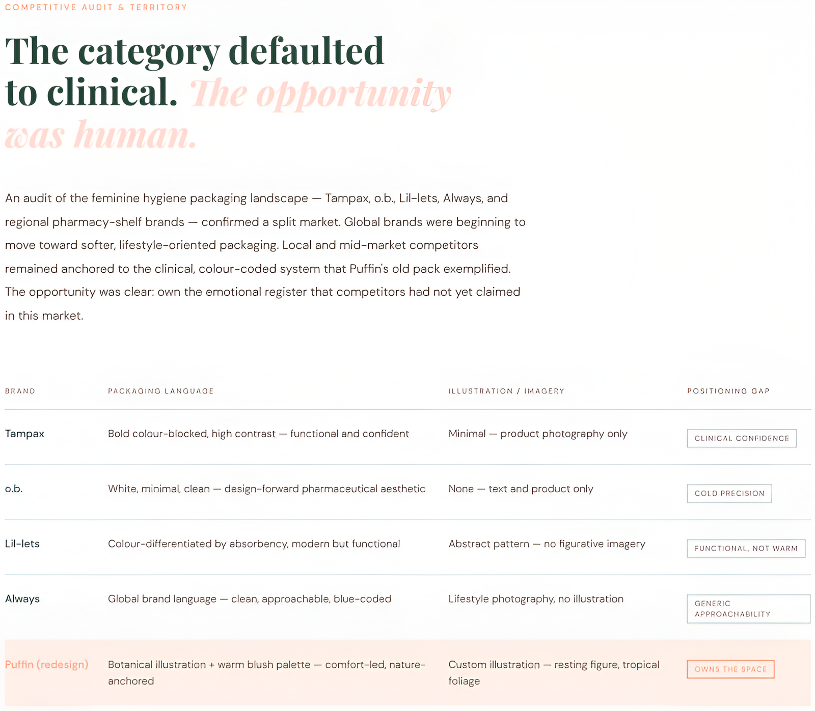
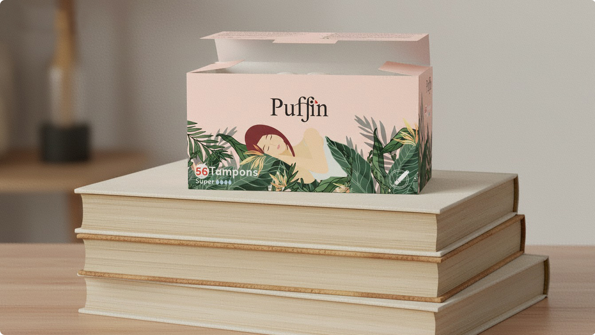
The original Puffin tampon packaging communicated the wrong thing entirely. Turquoise-blue and sharp pink on a clean, text-heavy ground — the visual language of a pharmacy shelf product positioned alongside antiseptics and bandages, not a premium, chemical-free tampon made in Europe.
The product’s specifications — free of 13 categories of additives and irritants, manufactured to European standards — were invisible on the old pack. The packaging actively worked against the product’s value proposition. In a category where trust and comfort drive purchase decisions, the brand was communicating neither.
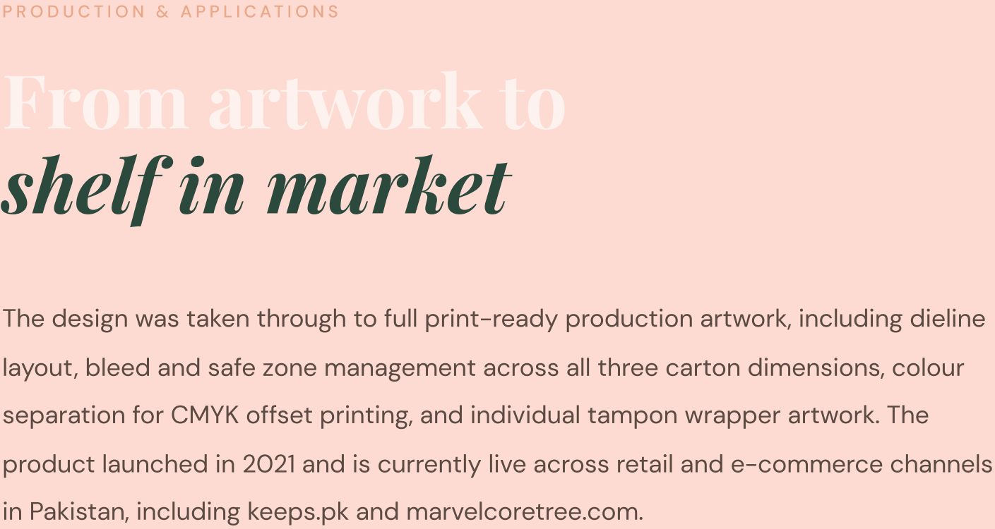
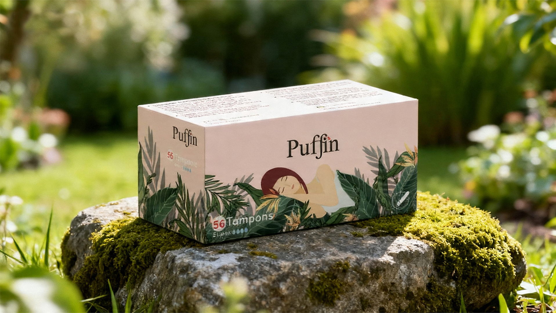
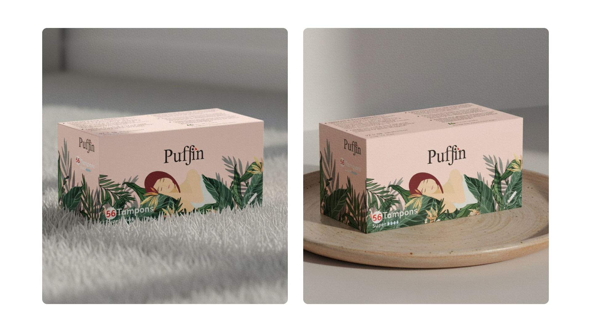
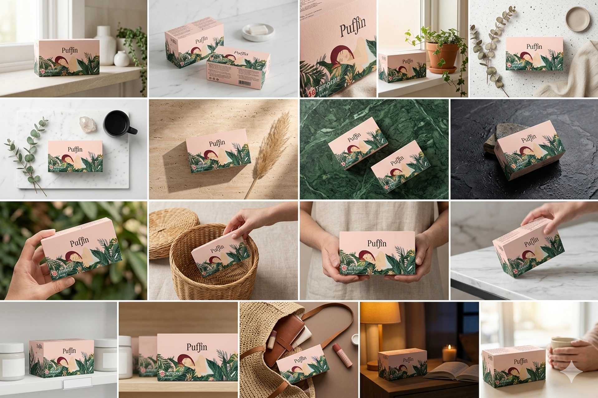
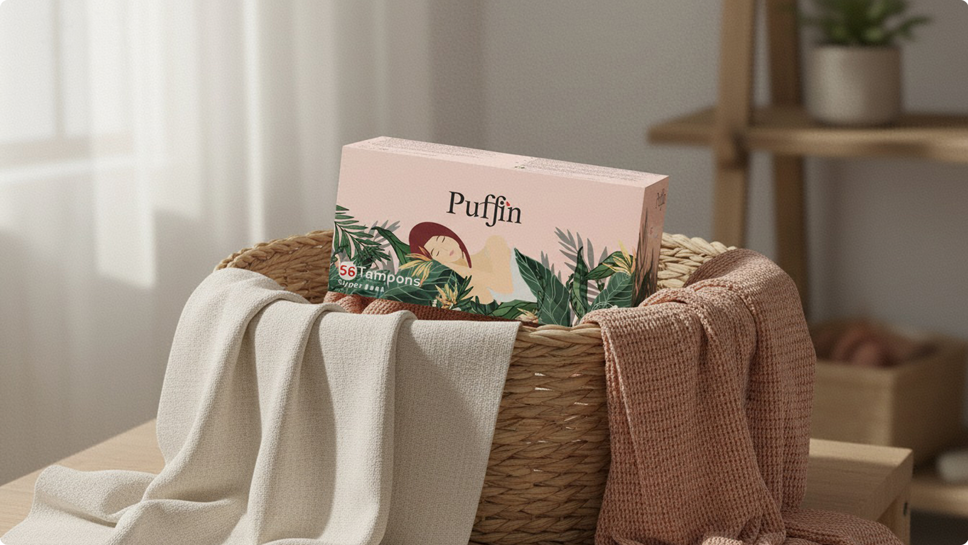
The brief from Marvel Core Tree was to reposition toward comfort and calm. The complete creative direction — concept, illustration language, colour palette, compositional approach, and typography application — was developed entirely in-house as part of this project.