Brand Identity — Case Study

Stokked Pro

A sibling brand given its own authority without leaving the family.

The Brand

Inventory intelligence for
POS providers at scale

StokkedPro is a white-label, fully hosted inventory and stock- control SaaS platform built for Point of Sale providers and multi- location retail and hospitality operators. It handles everything from automated stock depletion and procurement to recipe management and supplier control, removing the operational weight of inventory from businesses that need to focus elsewhere.

It is a product of the same team behind Extract Pro, an AI- powered data extraction platform. The brand entered the identity process under its original name, Stokked, before the client independently rebranded to StokkedPro, a change that sharpened its B2B positioning and set up a cleaner ecosystem relationship with its parent.

The Problem

A product built for
scale with no identity
built for trust

Stokked — as it was then known — had a functioning product and a clear market. What it lacked was an identity capable of converting a POS provider’s procurement decision. In a B2B SaaS context, the brand is the first due diligence. A generic wordmark and undefined visual system would not survive the scrutiny of enterprise buyers evaluating inventory infrastructure.

The rename to StokkedPro sharpened the target, but the visual gap remained. The new name needed a mark, a system, and a clear visual relationship to the Extract Pro parent — all without looking like a rebadged version of something else.

Strategy & Personality

Restrained intelligence
over generic tech symbols

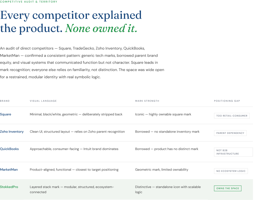
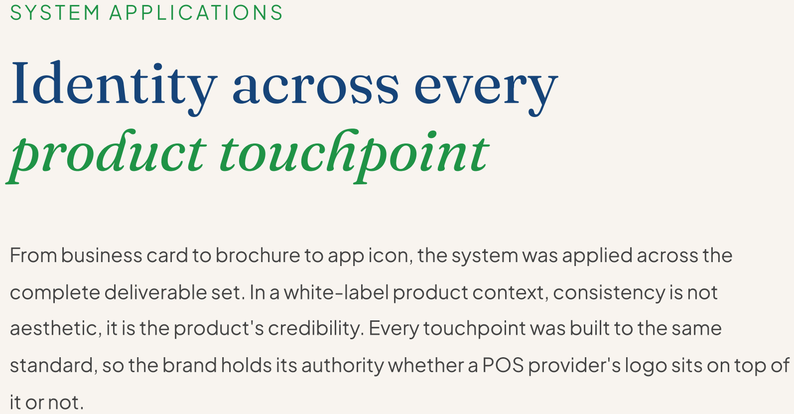
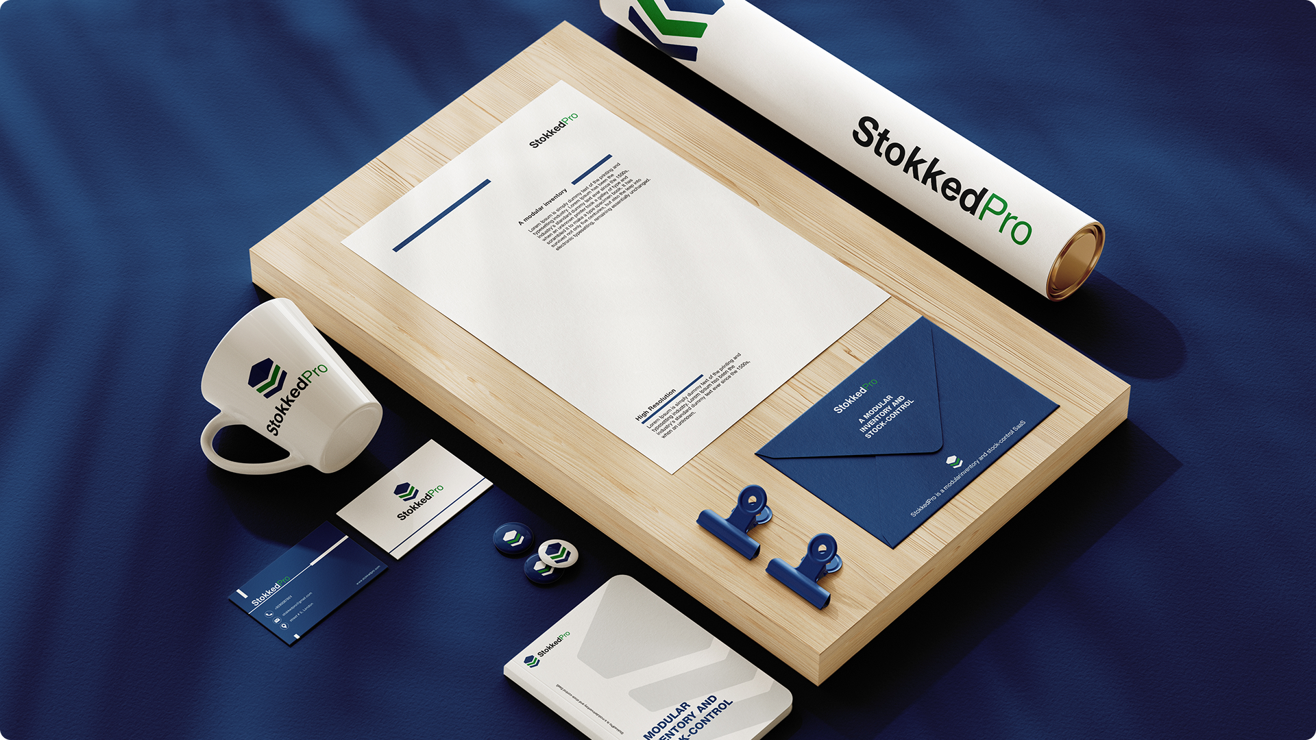
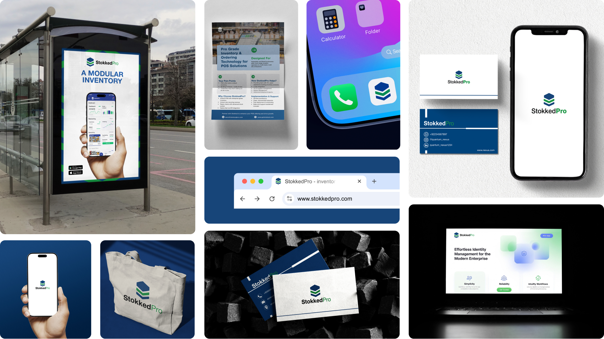
The strategic finding was precise: 60% of competitors rely on generic charts, arrows, or abstract tech symbols. This creates visual noise and zero differentiation. The brief to myself was to design a mark that signals capability through form, not decoration — one that a POS procurement manager would recognise as serious infrastructure, not another startup logo.

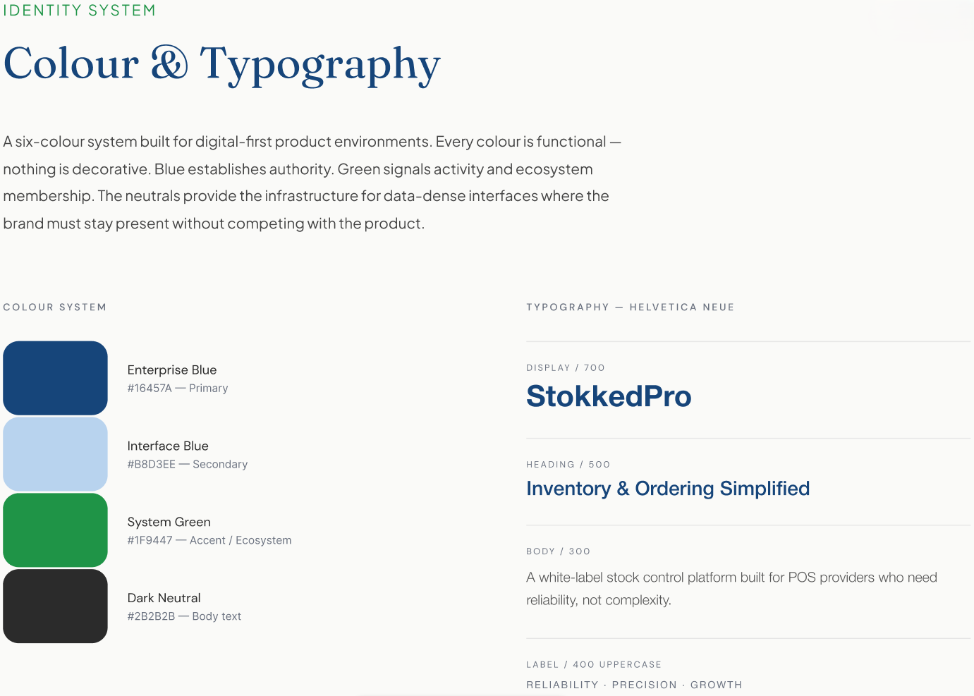
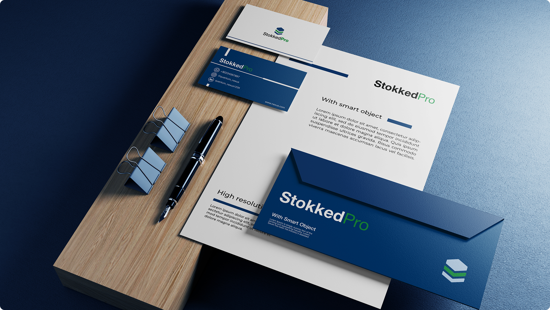
Helvetica Neue was the typographic anchor — neutral, trusted, and authoritative in B2B SaaS contexts. The primary blue (#16457A) establishes reliability and enterprise credibility. Green (#1F9447), carried from Extract Pro, signals system activity, growth, and ecosystem membership. The system earns its authority through restraint.

I help institutional and growth-stage companies build brand systems that close the gap between what they deliver and how they’re perceived.