Fabric as Social Identity

Book Cover Design

Fabric as Social Identity

Documentation of a 70-foot communal textile, positioned within a
Biennale about ecological depth.

Objective

A Biennale about
depth and ecology.
A cover that had to carry it.

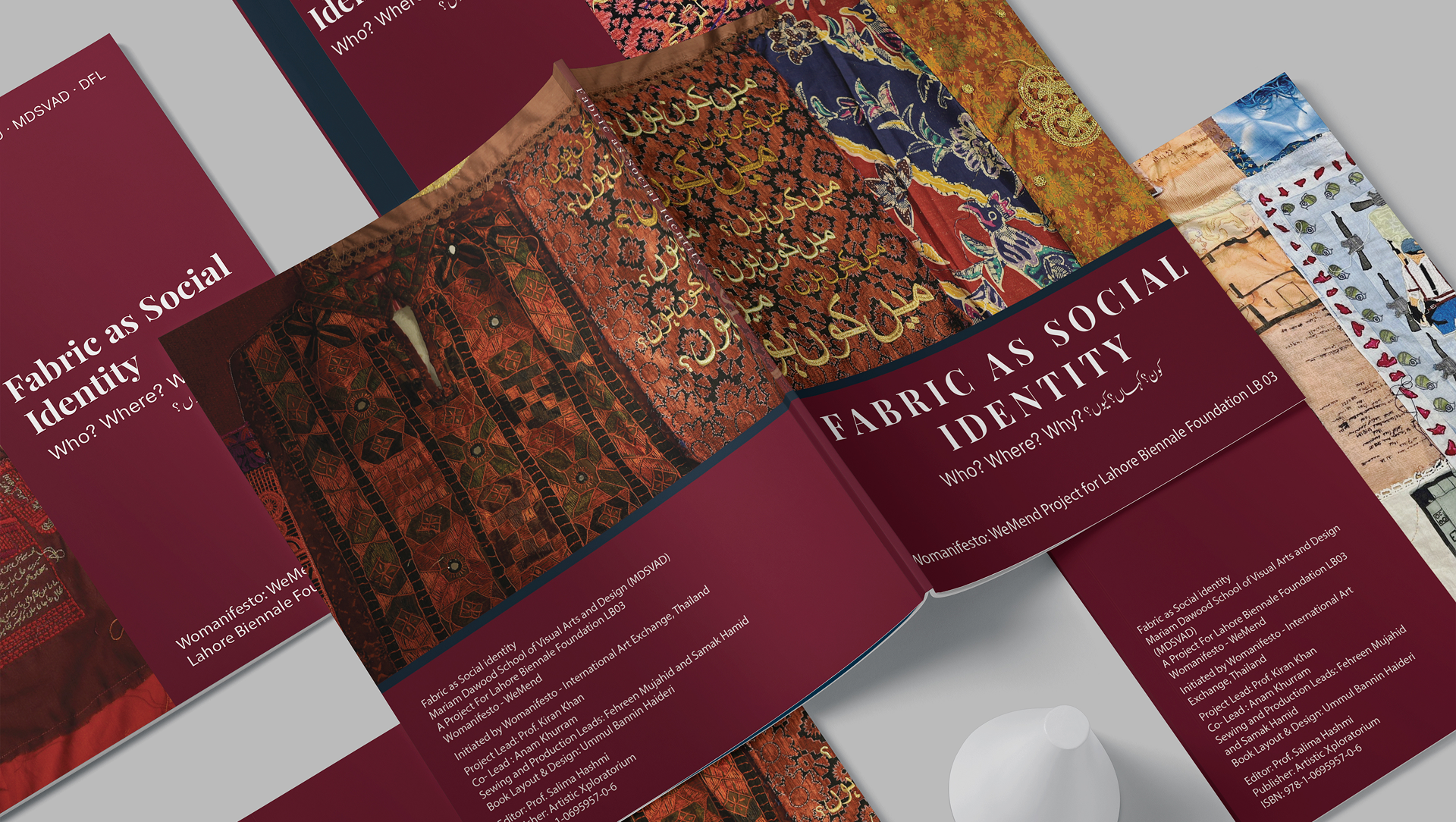
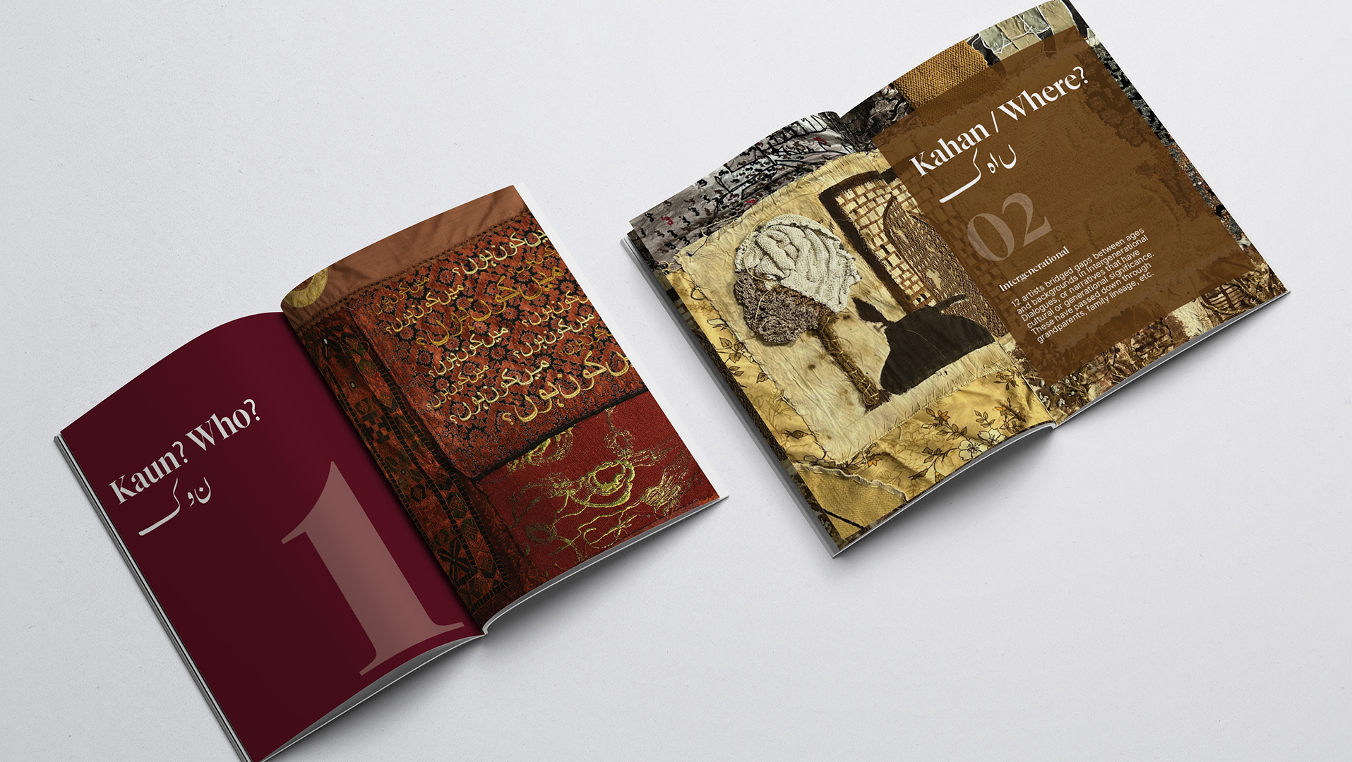
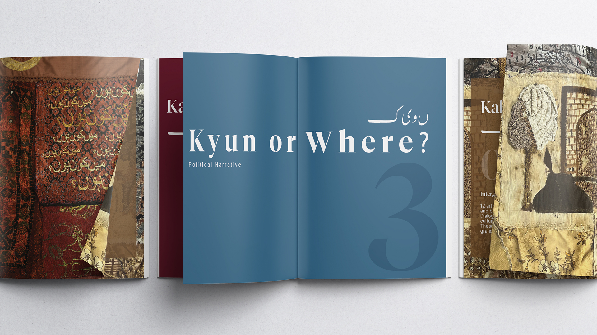
ThWomanifesto WeMend was not a single artwork. It was a 70-foot communal textile installation made by 32 fibre artists, BNU students and faculty, artisans from Kaarvan Crafts Foundation, Baazyaft, and the Tarogil community — brought together for the Lahore Biennale Foundation’s third edition, LB03.

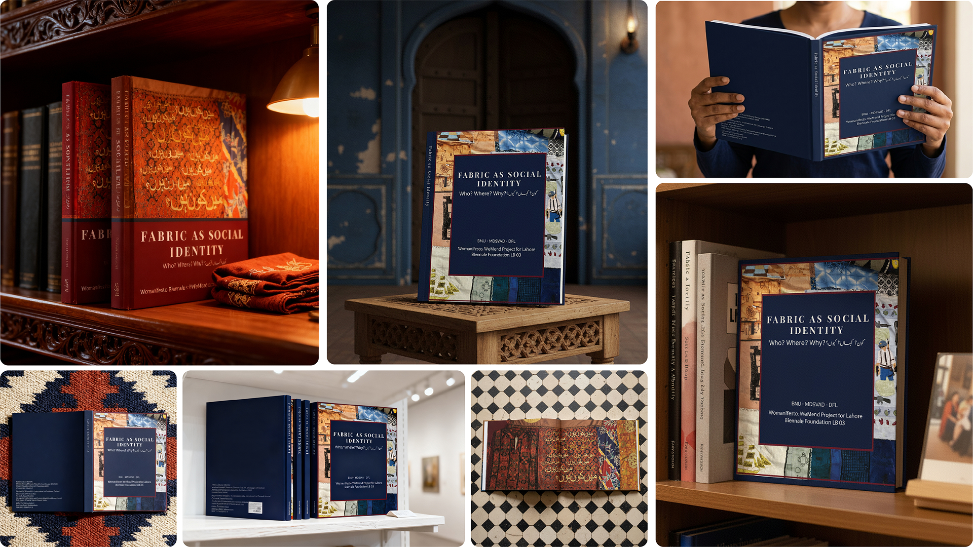
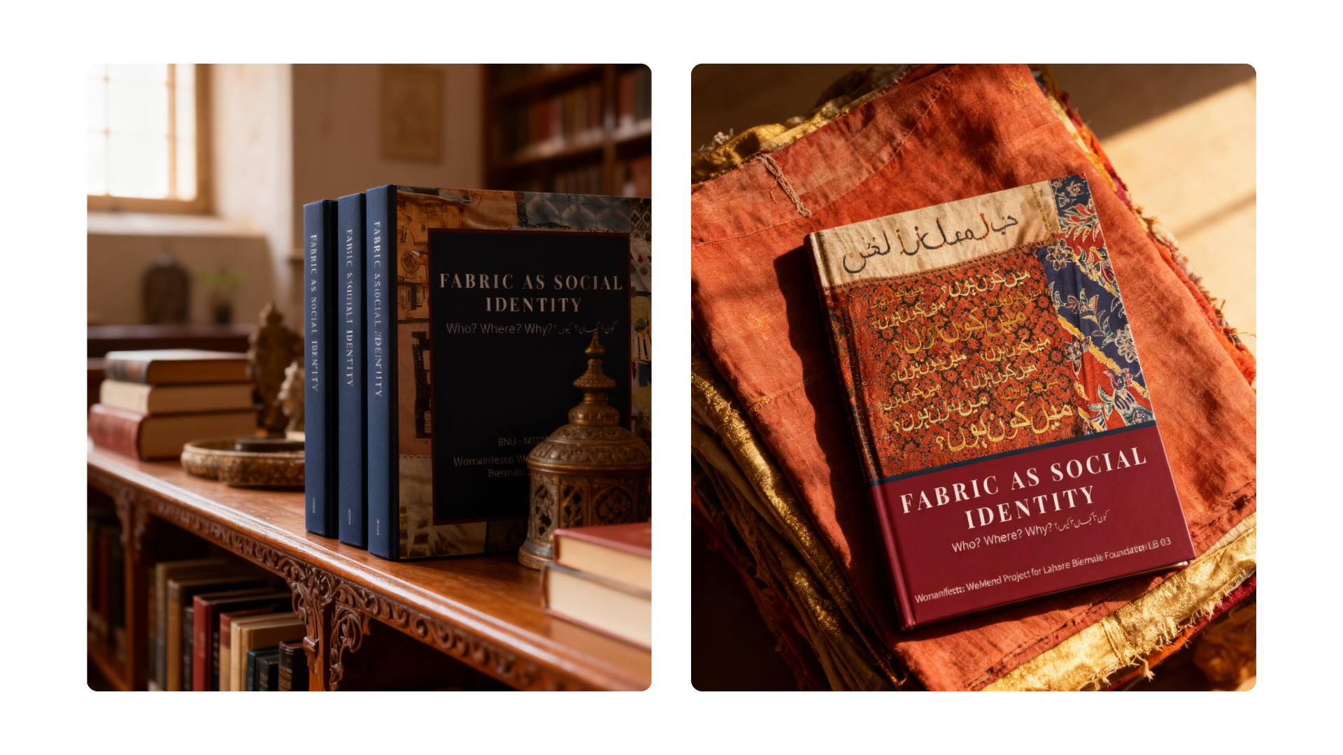
The publication, edited by Prof. Salima Hashmi and published by Artistic Xploratorium, had to document a project built from dozens of individual narratives — personal, intergenerational, political — under one title. The cover had to carry that weight without simplifying it.

Creative Approach

Navy was not

an aesthetic choice.
It was a thematic one.

The LB03 theme — Of Mountains and Seas — is built around water, depth, and ecological thinking. Navy is the colour of that conceptual world. Choosing it for the cover was not a preference for cool tones. It was a decision to anchor the publication visually within the Biennale it belonged to.

The maroon concept draws from the warmth of the textile installation itself — intimate, body-close, drawn directly from the dominant tones of the communal fabric. Both are honest answers. The navy was chosen because the book exists within a Biennale about seas. The cover had to know where it lived.

I help institutional and growth-stage companies build brand systems that close the gap between what they deliver and how they’re perceived.