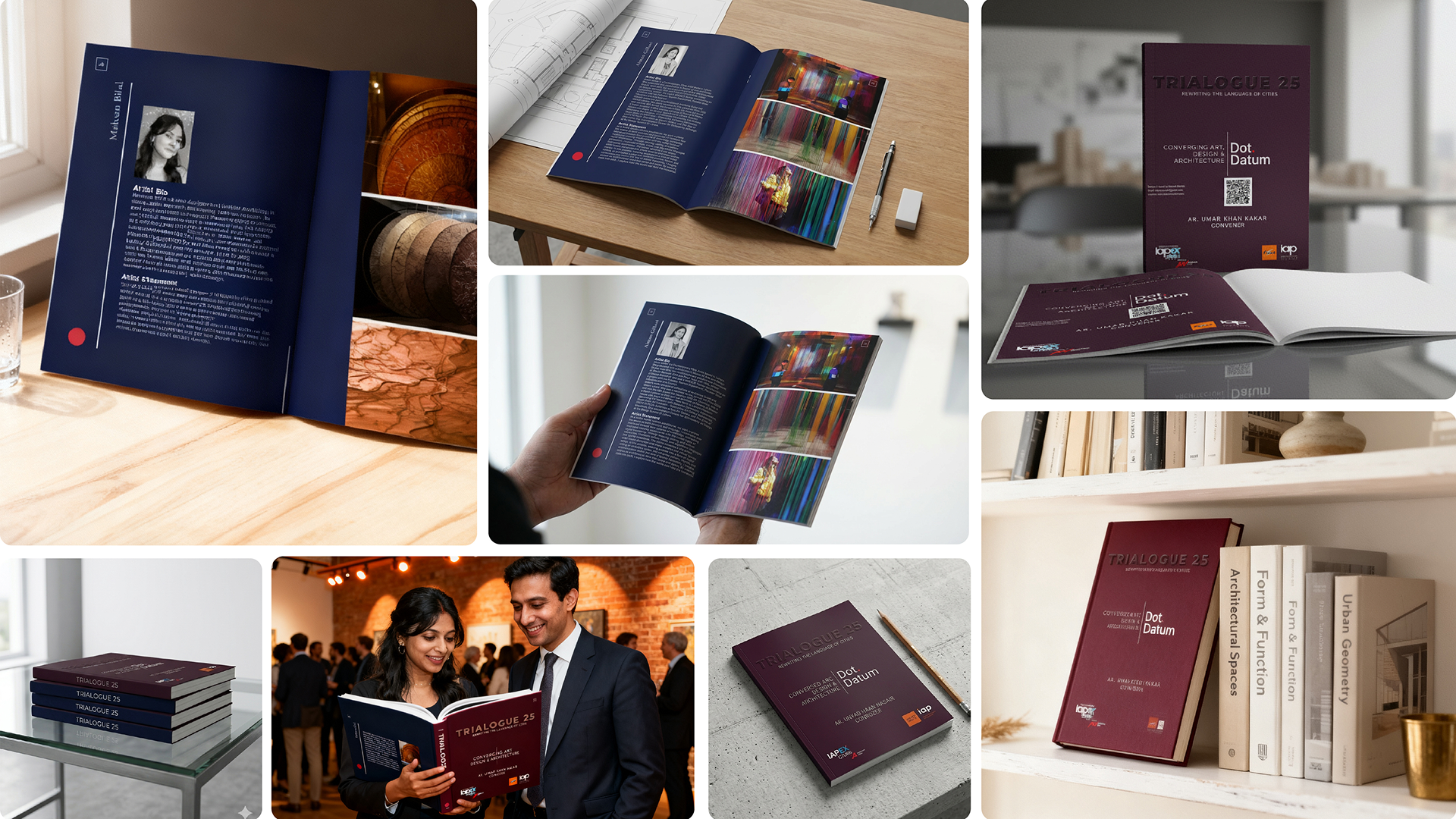
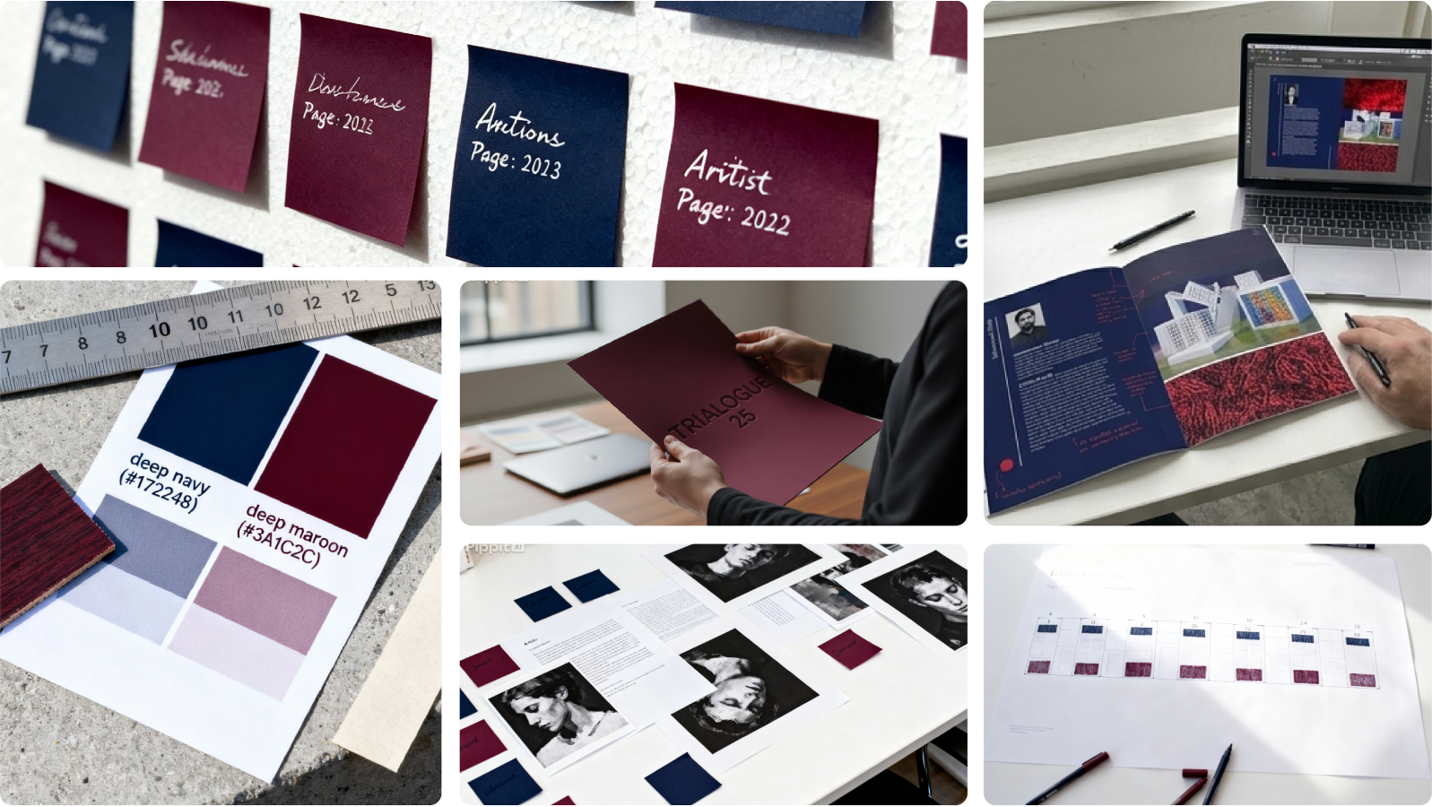
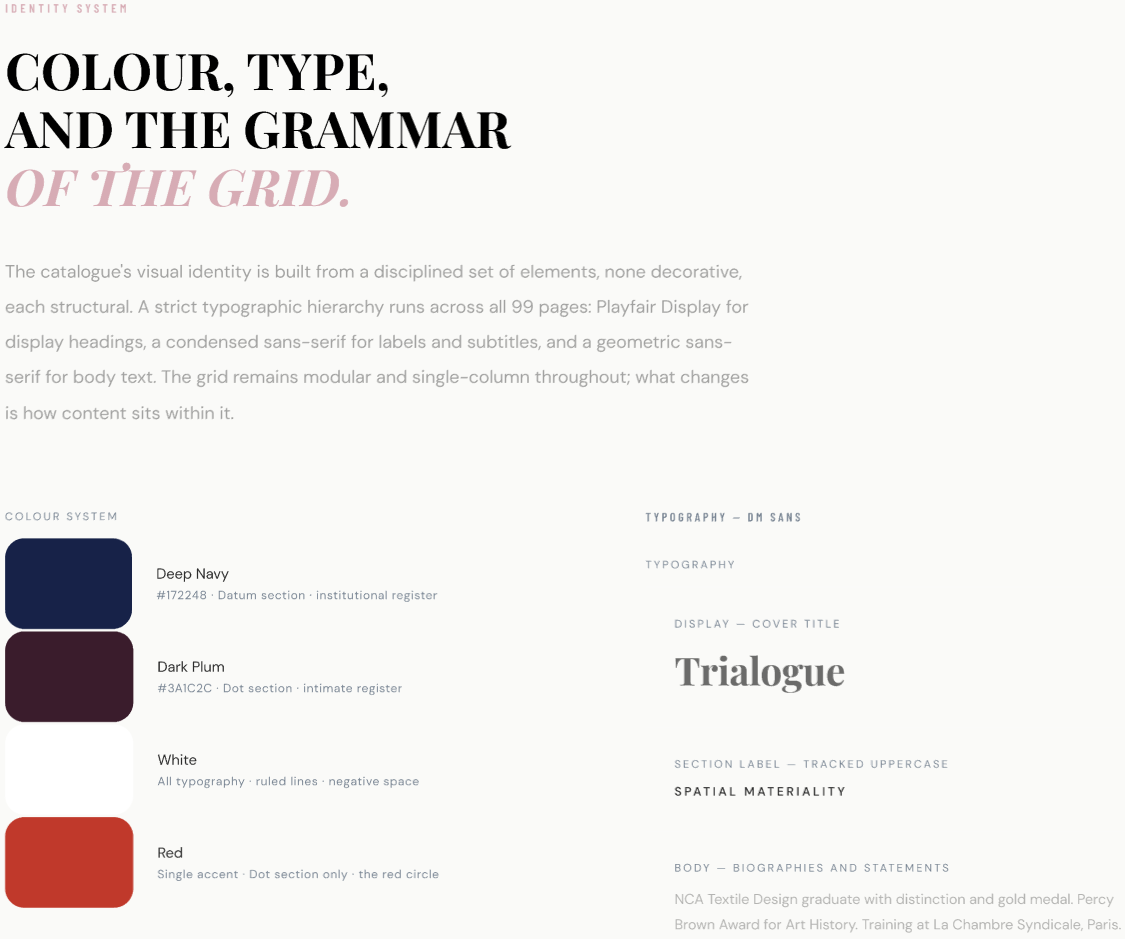
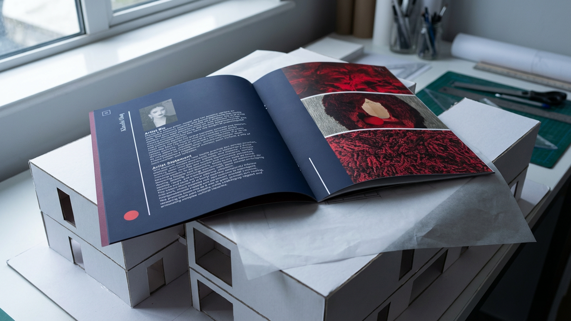
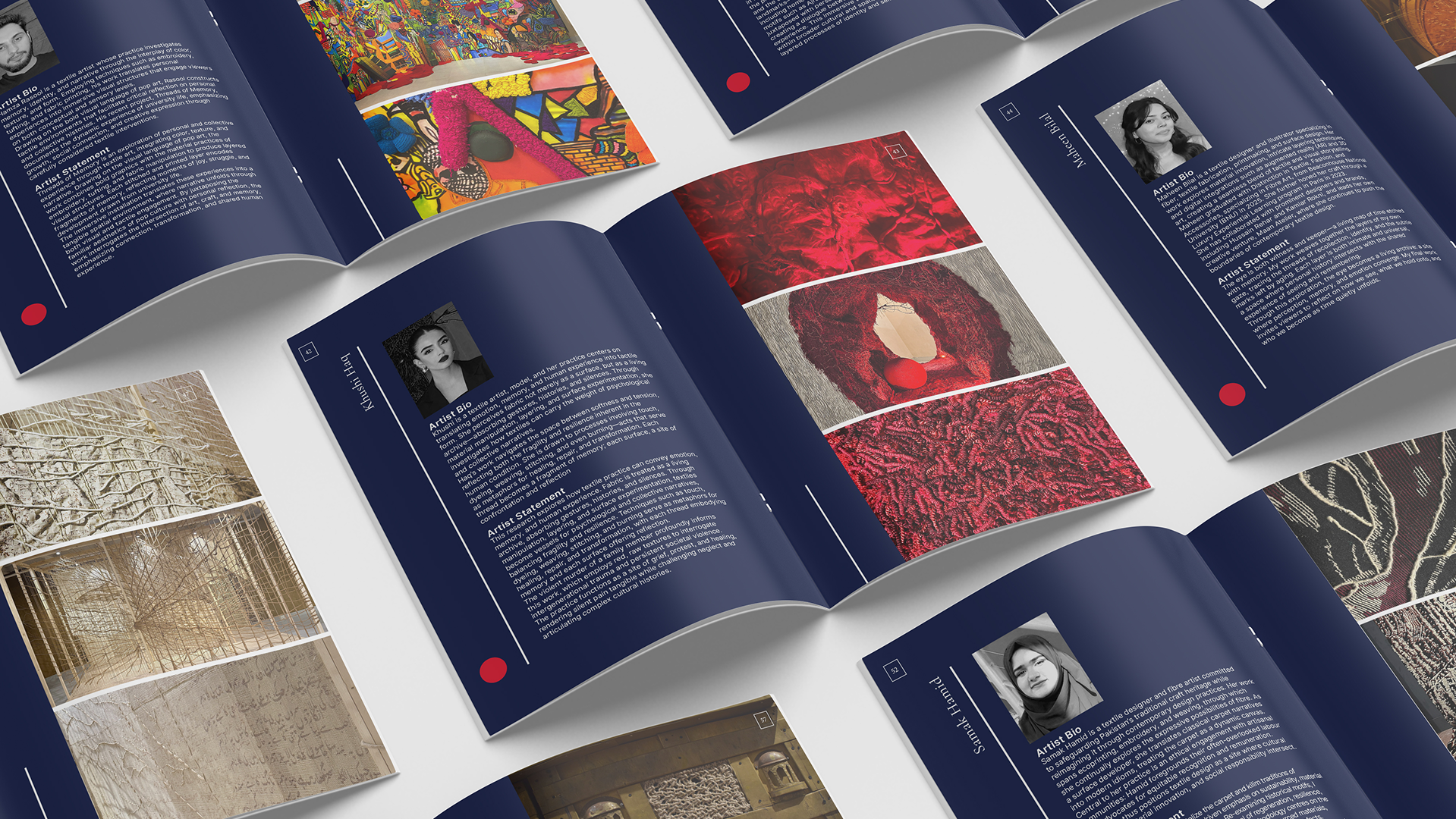
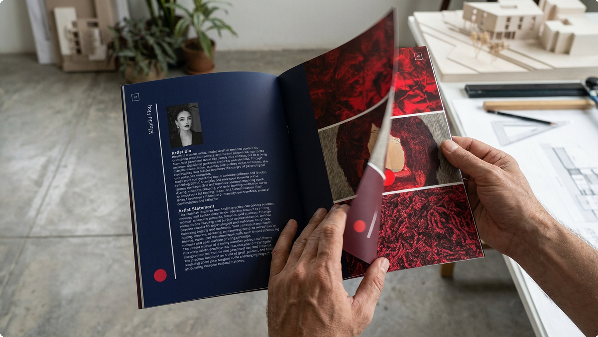
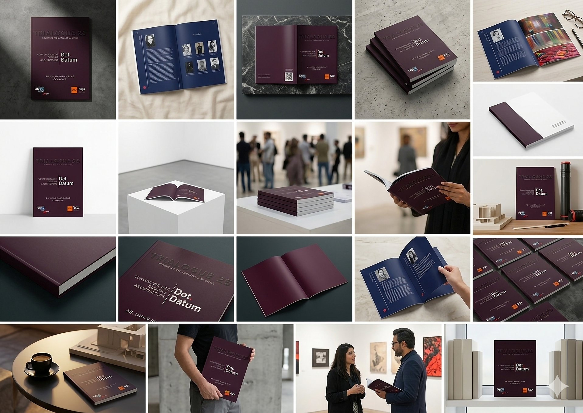
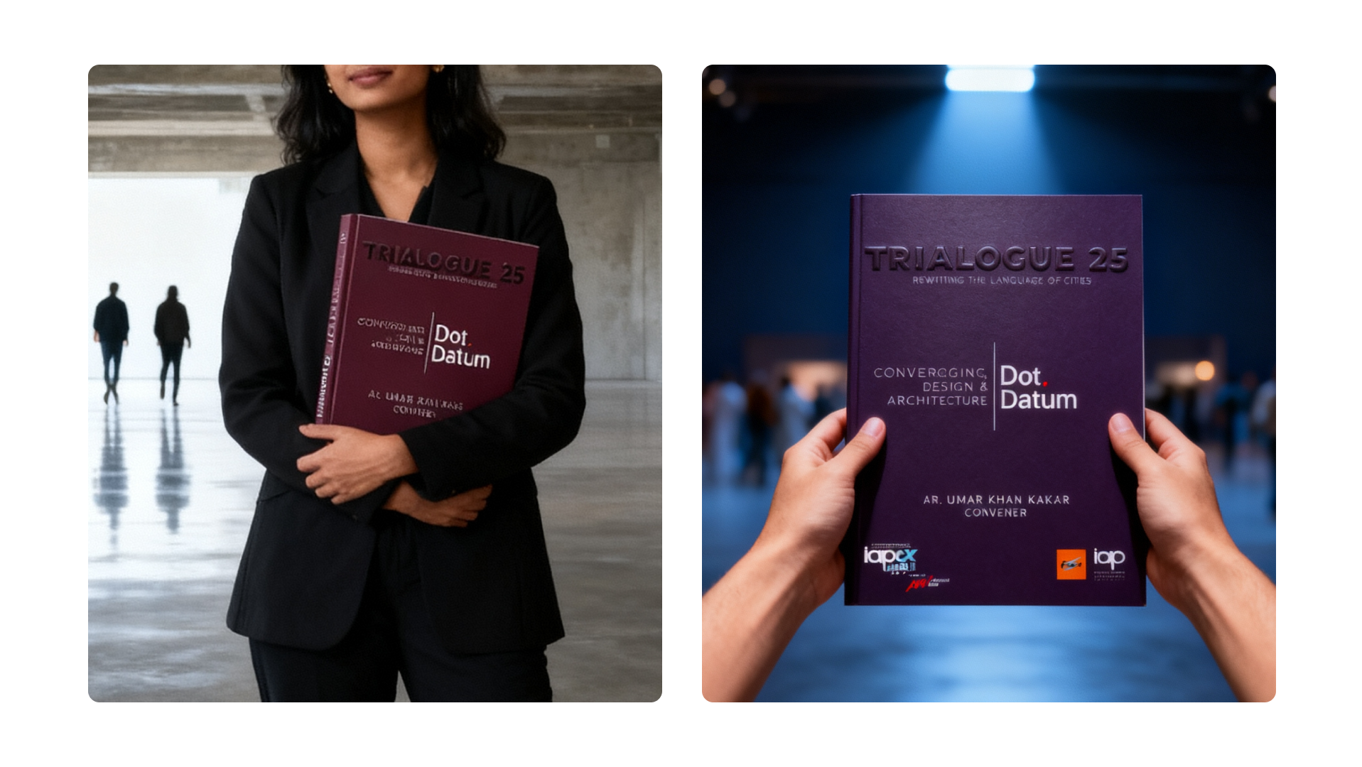
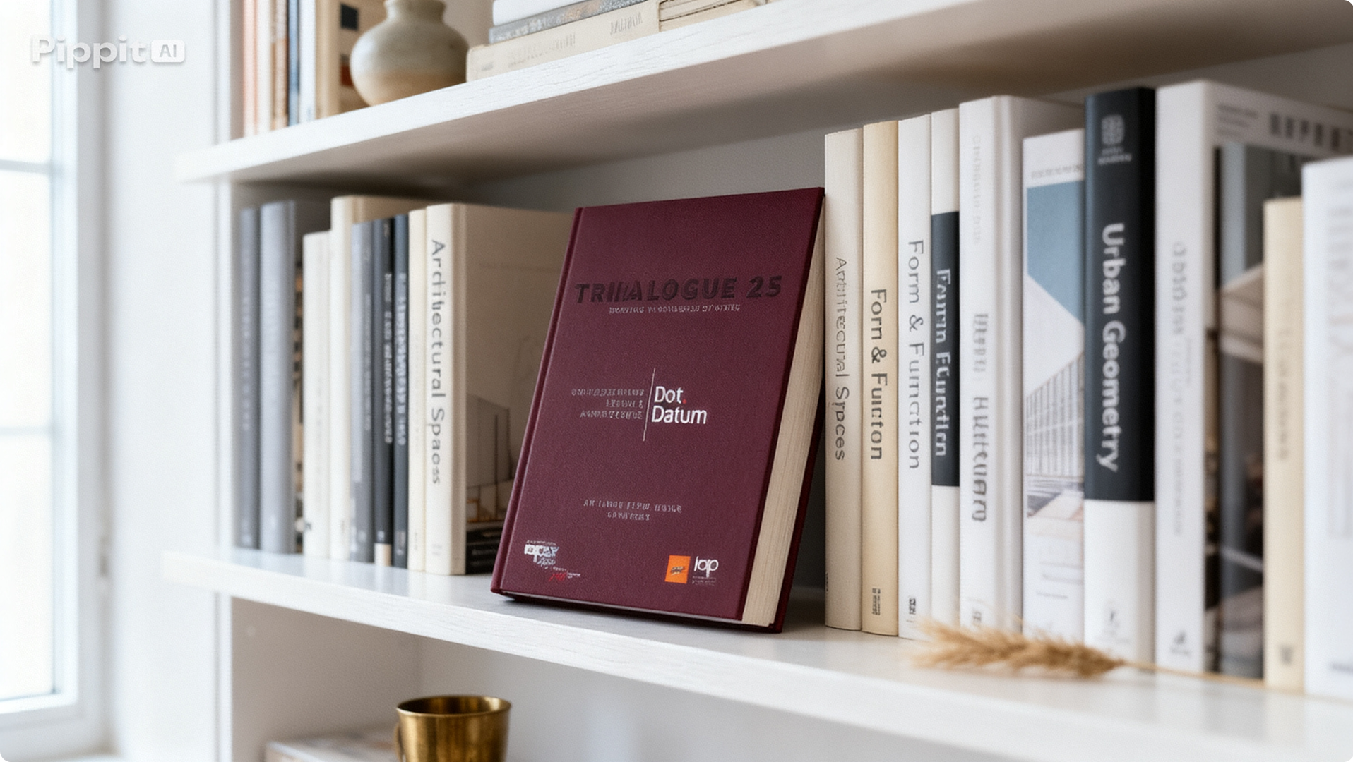
The decision to limit the entire catalogue to two colours, both of them near-blacks, was the most consequential design decision on the project. Deep navy (#172248) and dark plum (#3A1C2C) are close enough to read as a unified dark system at a distance. Up close, they are unmistakably different in temperature: the navy is cool, precise, institutional. The plum is warmer, more intimate, closer to the body. That temperature difference does exactly the work required to differentiate Datum from Dot without resorting to a colour-coded system that would reduce the publication to something closer to a departmental report.
The visual register this palette produces is closer to MoMA publications, Serpentine Gallery catalogues, and Phaidon monographs than to anything produced for Pakistani architecture events. That was the intention. Trialogue 25 was not positioning itself as a local event with an ambitious name. It was positioning itself as a legitimate participant in an international conversation about how cities are made and remade. The catalogue needed to look like it belonged in that conversation.
Within this system, a single moment of pure colour was permitted. One red circle. The restraint with which that accent was deployed is what makes it matter at all.