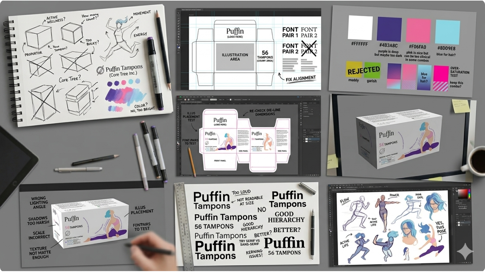
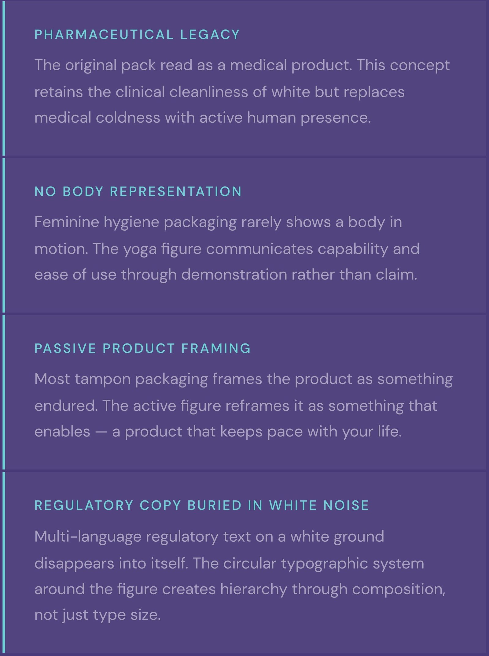
The existing Puffin tampon packaging communicated medical-grade function at the expense of any emotional register. It was white, text- heavy, and flat — a packaging language inherited from pharmaceutical design that positioned the product alongside healthcare commodities rather than personal care choices.
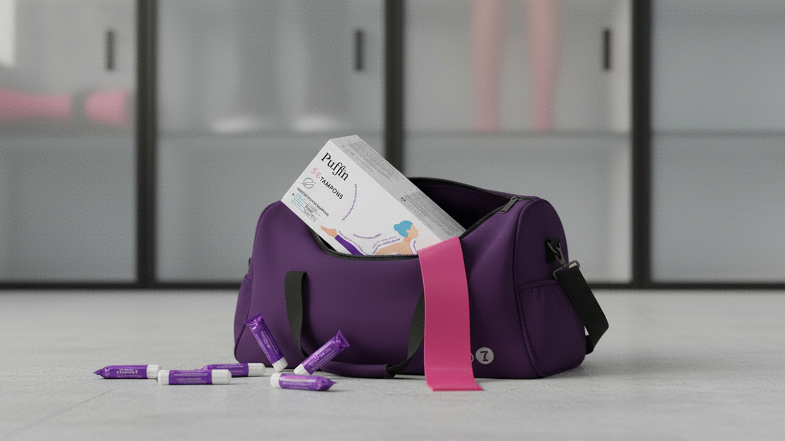
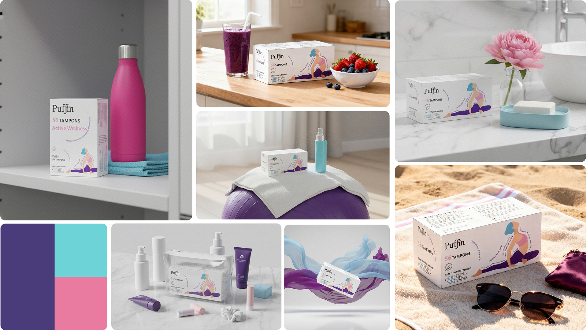
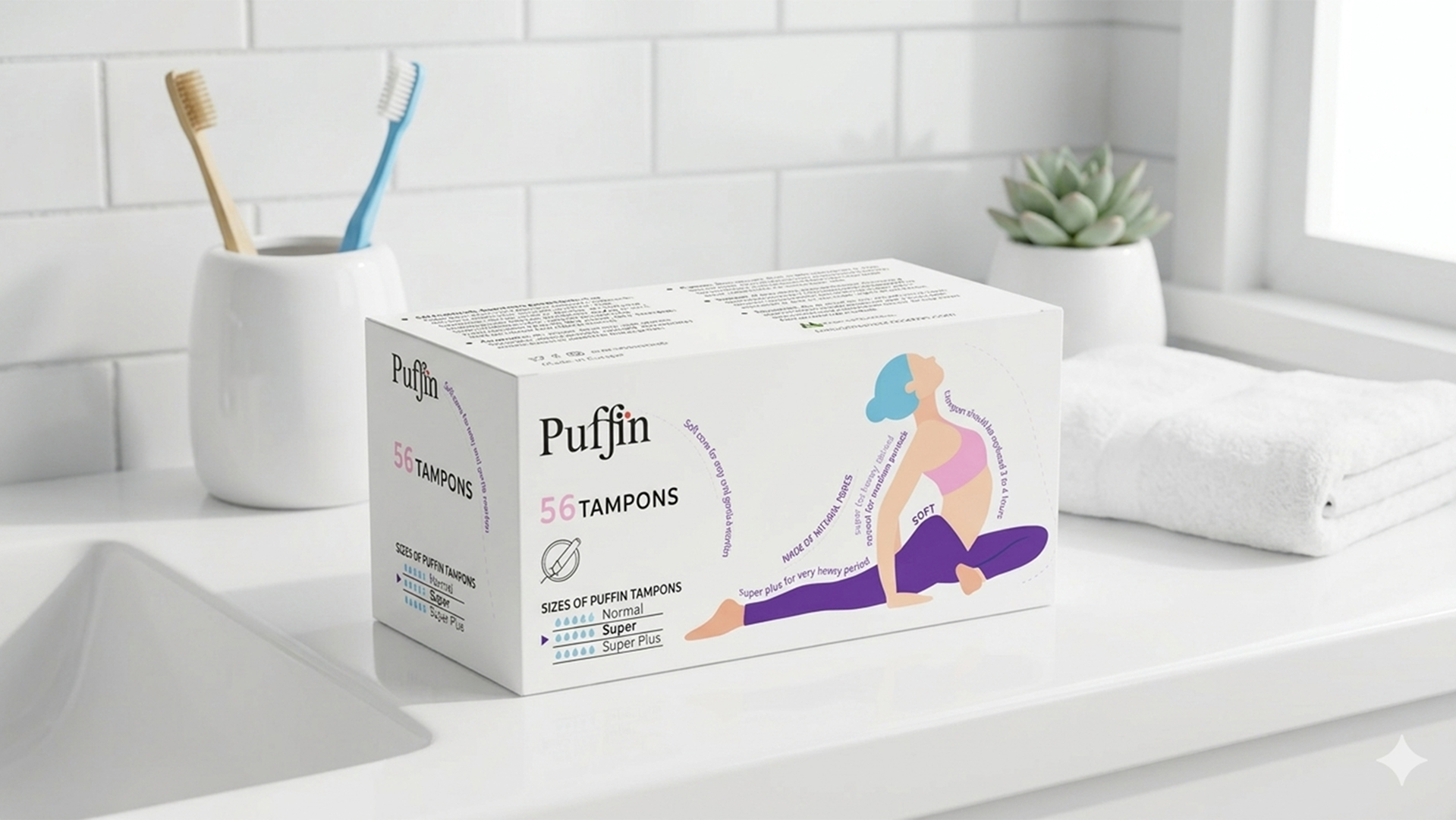
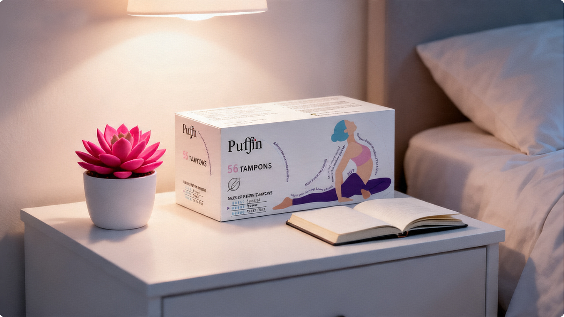
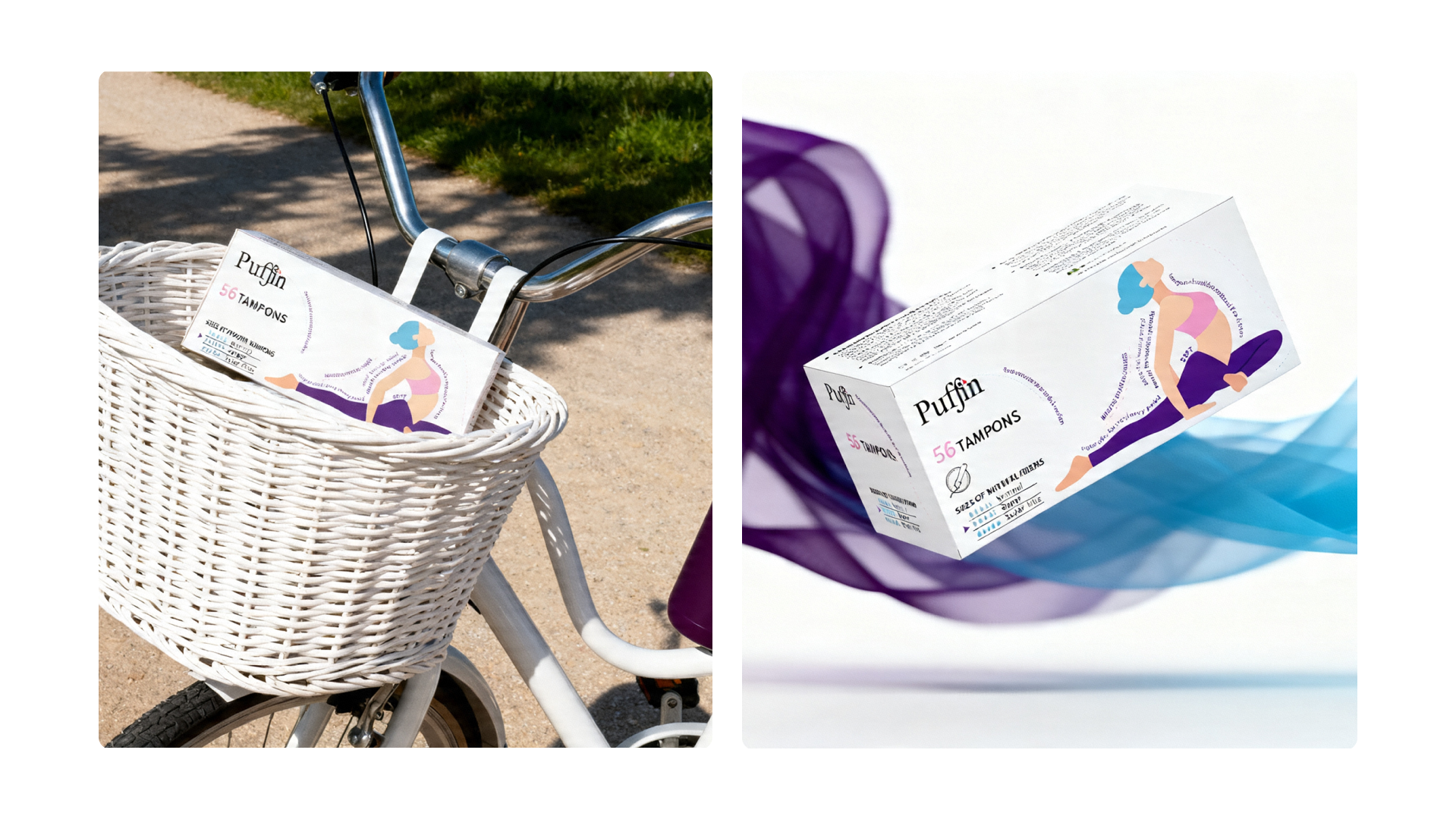
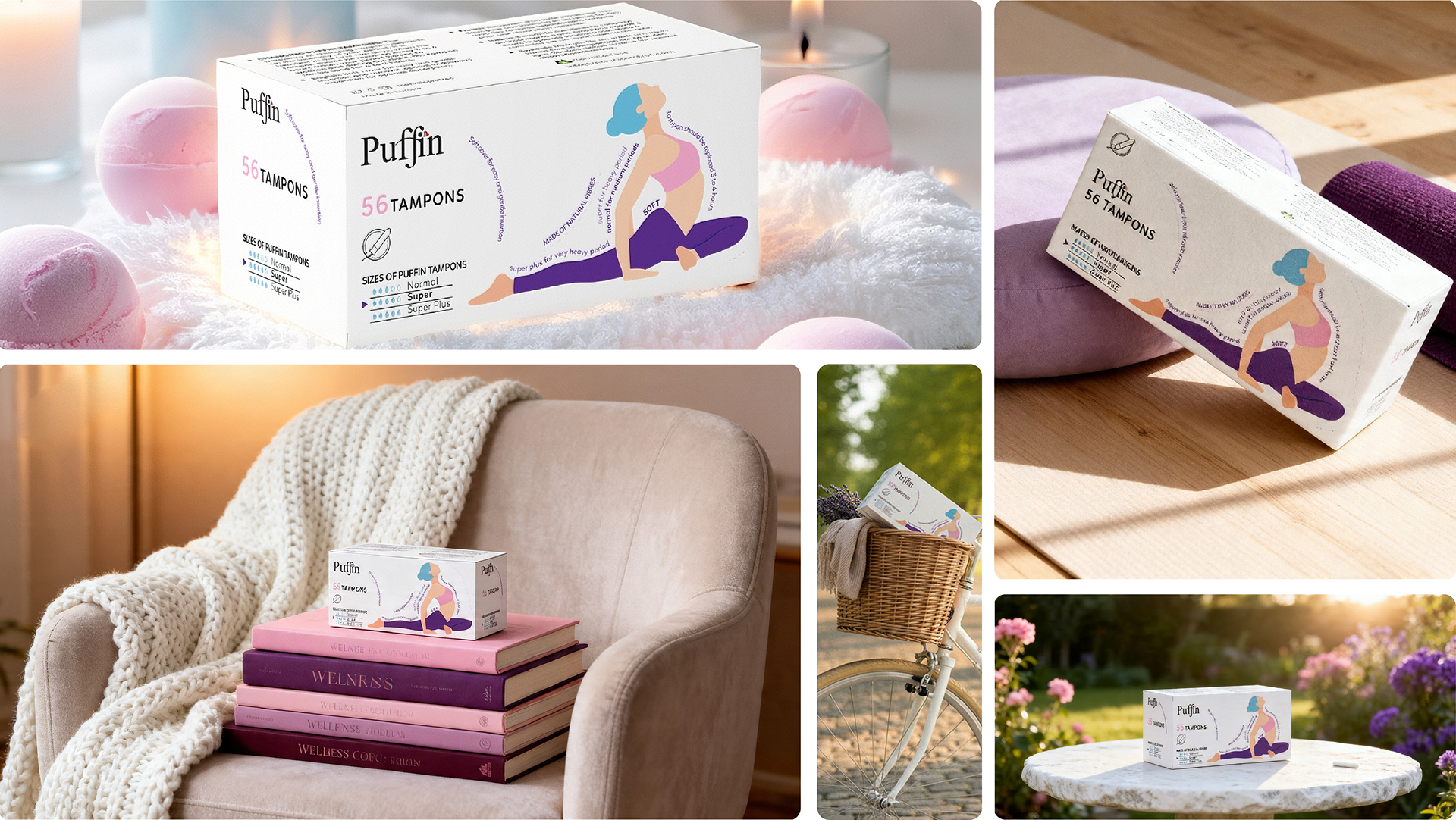
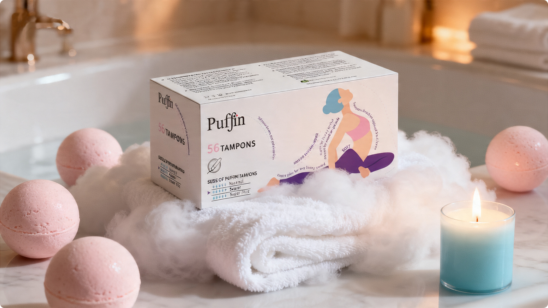
The strategic question this concept answered differently from Concept A was: what does confidence look like for a woman using this product? Concept A answered with rest — the absence of worry. Concept B answered with movement — the presence of capability. A body mid-stretch, fully extended, demonstrating that the product disappears into an active life rather than interrupting it.
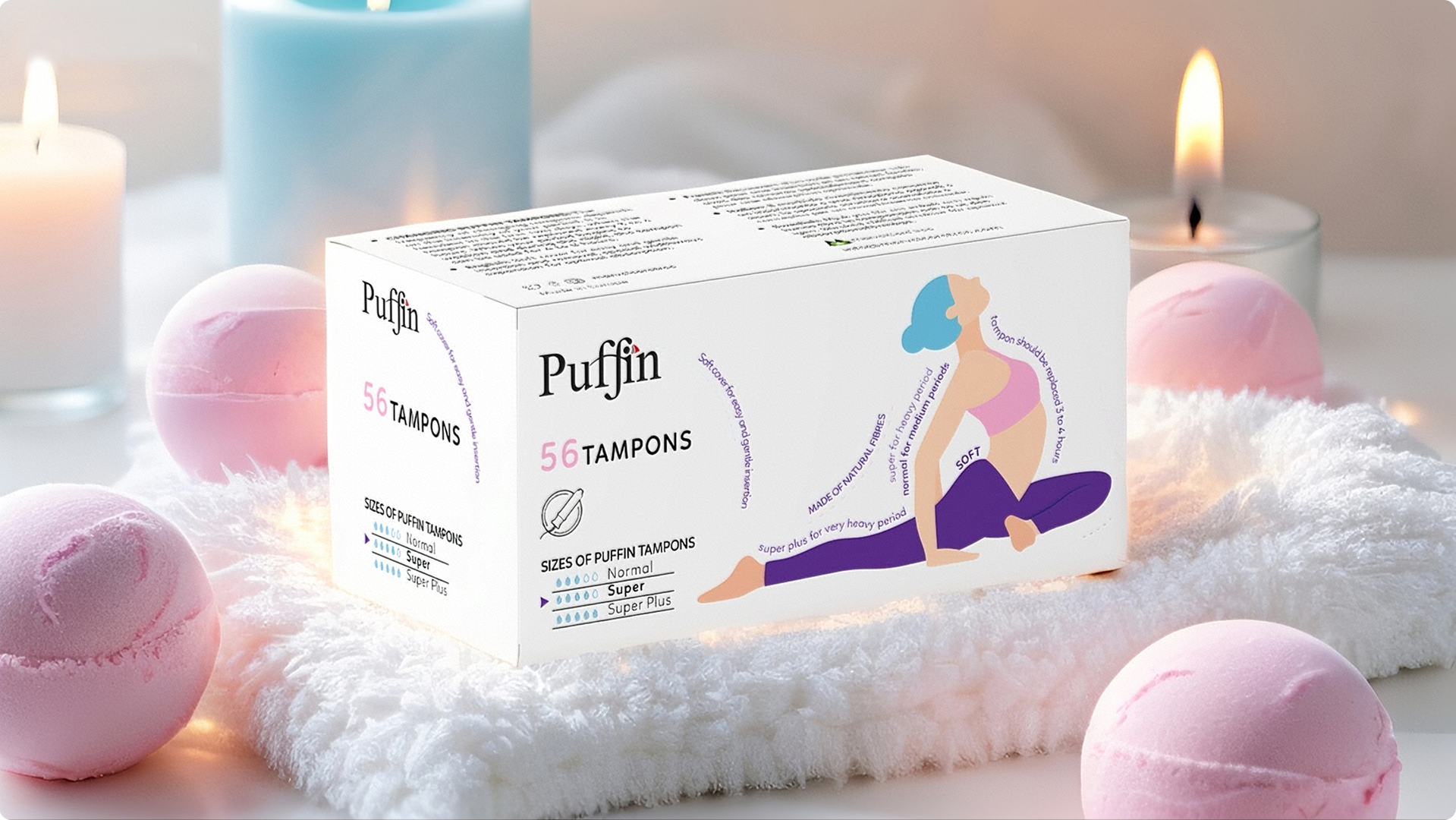
The white ground was a deliberate retention — not a failure to depart from the original. White in this context communicates cleanliness, transparency, and the brand’s certified-free formulation claims. The illustration does the emotional work; the ground does the trust work.